As we write more front-end code, we tend to learn several ways to solve any given problem. As a result, we grow increasingly confident about our ability to solve a problem, and less confident that we've architected the correct solution to that problem.
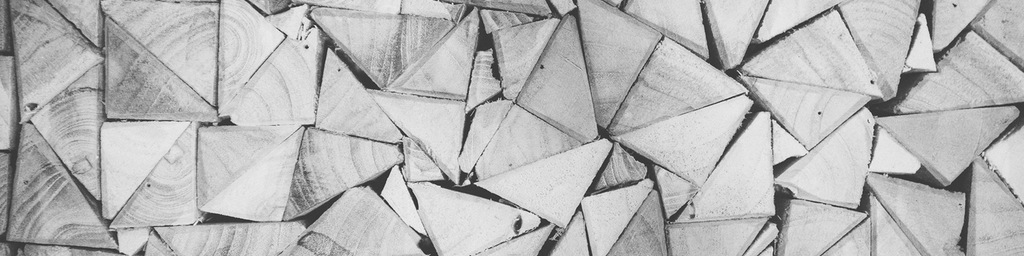
One the tests I frequently give new front-end developers is drawing shapes in pure CSS, no images allowed. This forces a step away from simply providing the first available solution (using images) and suggests performance considerations (code is faster than images) and creativity (there is no HTML "triangle" tag). Most importantly, being able to draw complex shapes in CSS also demonstrates a much deeper understanding of the box model, positioning, and z-indexing, and watching a new developer think through the process of drawing a complex shape can reveal quite a bit about their analytical thinking ability.
We'll start our triangle with a regular CSS rectangle, and add a background color so it's easier to see.
1
2
3
4
5
.triangle {
width: 200px;
height: 200px;
background-color: #2F4F4F;
}
Now we'll add a thick border all the way around our rectangle:
1
2
3
4
5
6
.triangle {
width: 200px;
height: 200px;
background-color: #2F4F4F;
border: 50px solid #444;
}
Pretty basic CSS so far, and it doesn't seem at all obvious how we're going to get from here to a triangle. In particular, I couldn't figure out how to get the diagonal parts of a triangle to work from CSS's box model, which deals in distinctly rectangular shapes.
That's because it's difficult to see how the border actually works. In CSS, when you define a border the way I did above, you're actually using shorthand; your browser interprets this as a 50px gray border on the top, right, bottom, and left sides of your rectangle. The edges where the borders meet are diagonals, like a picture frame. Let's alternate colors so this is easier to see.
Pay attention, this part is important:
1
2
3
4
5
6
7
8
9
.triangle {
width: 200px;
height: 200px;
background-color: #2F4F4F;
border-top: 50px solid #000;
border-right: 50px solid #ccc;
border-bottom: 50px solid #000;
border-left: 50px solid #ccc;
}
See the Pen PwwwJM by Dave Chakrabarti (@nonprofitable) on CodePen.
When I was figuring this out for the first time, that was my ah-ha moment.
Now we just need to kill the width and height of the main box to bring everything to a point, and let the borders form our shapes for us:
1
2
3
4
5
6
7
8
9
.triangle {
width: 0px;
height: 0px;
background-color: #2F4F4F;
border-top: 50px solid #000;
border-right: 50px solid #ccc;
border-bottom: 50px solid #000;
border-left: 50px solid #ccc;
}
See the Pen MYYYQm by Dave Chakrabarti (@nonprofitable) on CodePen.
Do you see the triangles?
Now we just need to subtract the extras. If I want a triangle pointed up, I just make the others transparent.
1
2
3
4
5
6
7
8
9
.triangle {
	width: 0px;
	height: 0px;
	background: transparent;
  border-top: 50px solid transparent;
  border-right: 50px solid transparent;
  border-bottom: 50px solid #000;
  border-left: 50px solid transparent;
}
Note: You'll also need to change .triangle to a transparent background instead of the background-color we were using earlier. Otherwise, even though you've shrunk it to 0px x 0px, the borders you make transparent will just inherit that color instead of a true transparency.
Once you start experimenting with this, you'll realize tweaking the width of the transparent left and right borders can make for some interesting asymetrical shapes. Combine these with CSS rectangles and circular shapes, and you've got the building blocks for some fairly complex elements.
Here's a Codepen version of the final code, in case you want to play with this without firing up your local dev environment.
.triangle {
width: 0px;
height: 0px;
background: transparent;
border-top: 50px solid transparent;
border-right: 50px solid transparent;
border-bottom: 50px solid #000;
border-left: 50px solid transparent;
}See the Pen Very basic CSS triangles demo by Dave Chakrabarti (@nonprofitable) on CodePen.
Edit: After digging around online, I found an excellent animation that explains this concept, by none other than Chris Coyier of CSS Tricks and Codepen.
See the Pen Animation to Explain CSS Triangles by Chris Coyier (@chriscoyier) on CodePen.